In the foreground of a bucolic landscape perches a bird captured with “nothing to see here” picture-book nonchalance. It requires a well-deserved double-take to reveal the rifle tucked under a wing. The scene features additional armed and blasé birds, undeniably the precisely crafted work of artist Michael Oatman. So skillfully crafted in fact, that, at first glance, they avoid being interpreted as a collage at all.
Michael’s art is neither opaque in its meaning, nor does it display haughty disregard for the viewer. Its themes are hyper accessible, torn—in many cases literally—from a familiar past. While never telling you what to think, it nudges you, however politely, to think. The image might be an apocalyptic one, yet it more than likely will leave the viewer with a sly smile on their face, no mean feat, and Oatman pulls it off time and time again. Such is the hand of the master.
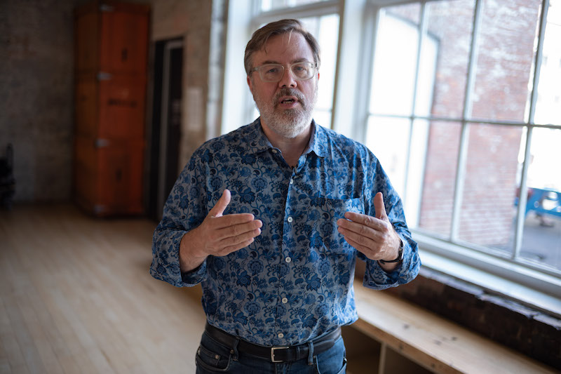
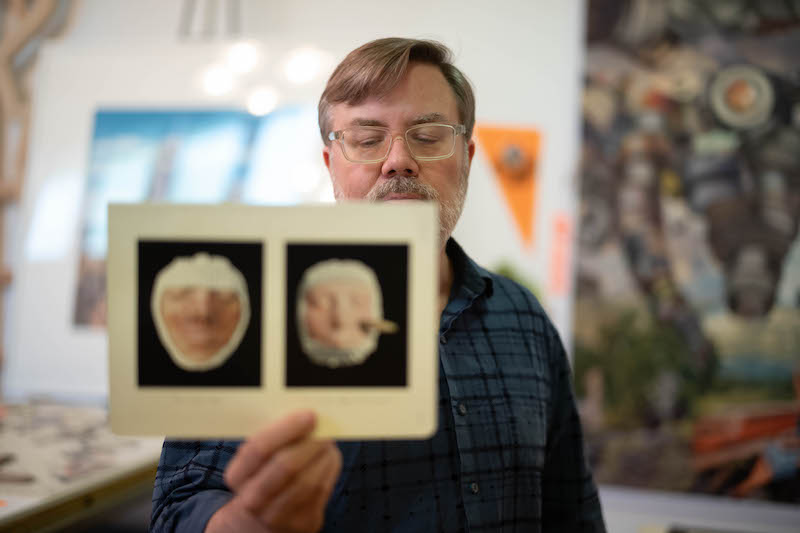 Michael has taught at Harvard, University of Vermont, SUNY Albany, St. Michael’s and Vermont College. He teaches architecture at Rensselaer Polytechnic Institute, where he has been a faculty member in the School of Architecture since 1999. He has shown work, both his collages and complex installations, widely in the northeast and beyond. His “un-vironment” “All Utopias Fell” is on display at the Massachusetts Museum of Contemporary Art in North Adams, Massachusetts.
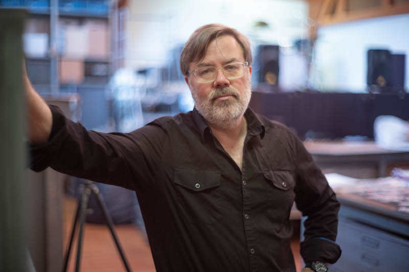
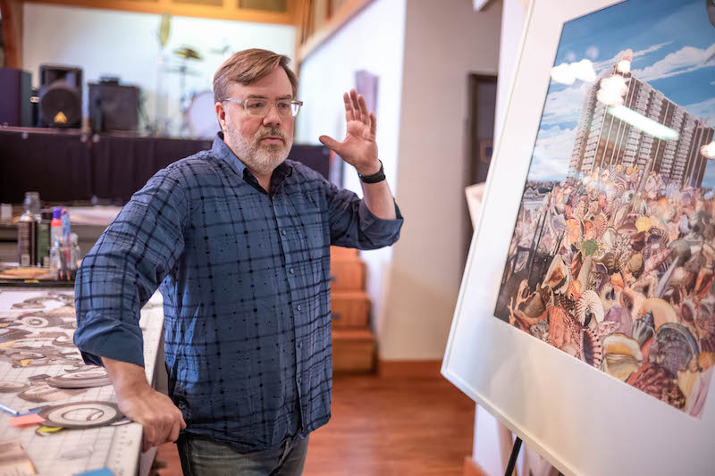
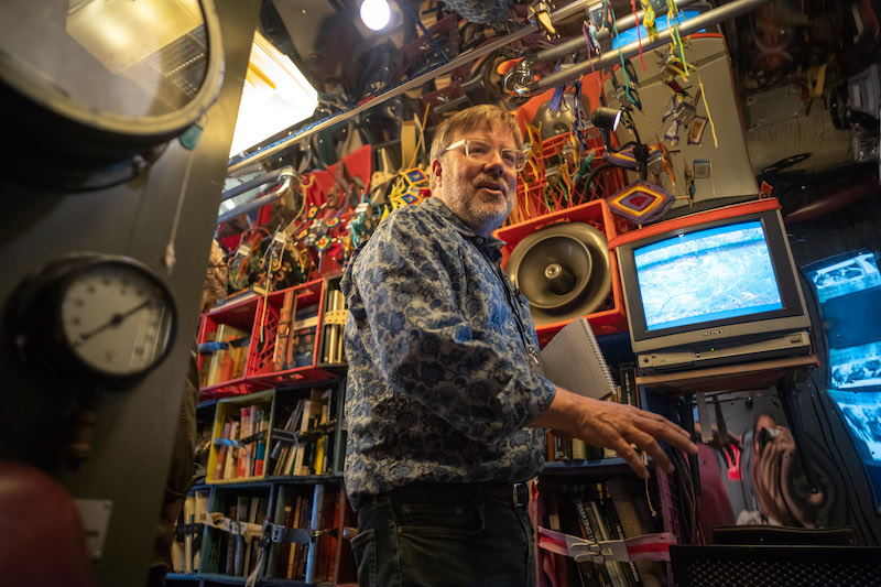 Born in Vermont, Michael lives and makes art in Troy in a former community center, both comfortable and completely bent to the will of his creative impulses. We conducted our interview there in one of the art-filled bedrooms.
Richard Lovrich: What compelled you to use collage as a medium?
Michael Oatman: Collage was a chance encounter for me before I was an artist. I was making these little films in high school. “The Worst Movie I Ever Made,” “The Son of The Worst Movie Ever Made,” “The Esophagus Exchange.” They were kind of campy thrillers and little skits and bits. We had one moment in the film where we needed people reading magazines. My mom subscribed to a cooking magazine, now defunct, that was very good, called Sphere. I think the title was a reference to the world of cooking. This sphere of cuisine. I found an issue that had a brioche on the cover. I cut out and rearranged the S-P-H-E-R-E to say “HERPES” and put it back together. We had people reading EMIT magazine, instead of TIME, and HERPES. It wasn’t the point of the scene, it was just a little window dressing.
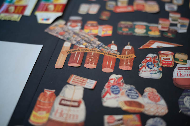 When I got to Rhode Island School of Design, I was taking drawing courses and two-dimensional design and three-dimensional design. Here (collage) was a way of working that was being advocated on some level, but we were cutting up our own drawings. I decided to look back to some of these magazine sources. It was first not even an art gesture, really, I mean it was an art direction move for a little film, but I think that I enjoyed the humor and also the instantaneous quality of it. I could see the word in my head, have the idea, cut it out, and the thing was made in 10 minutes. It was a sub. It was like a stunt double for something else.
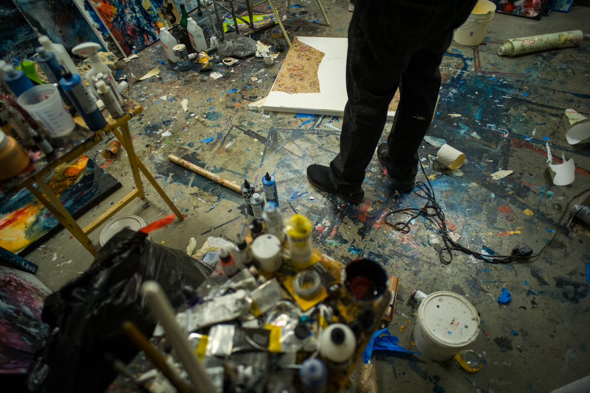
RL: An artist’s studio provides evidence of the artist’s process. In your case, it doesn’t appear that many of the spaces in your home, save the toilet and the kitchen, have escaped becoming either storage for elements to be used in the future, completed pieces or production space.
MO: Sure. Well, I’ve had periods where I didn’t have a studio and so I used the kitchen table. I used the back of a pickup truck. I’ve used the seat of the pickup truck. In fact, I got evicted from my building in 2005 and, very deliberately, I spent a whole year not making art in my studio, which I still had access to, I just couldn’t live there anymore. As for this space now, I’m trying to treat it a little bit like new outlook, new work. I’m cutting out things in the living room. I’m maybe doing some printing in the big studio. I’m building things in other places. I always have four or five different projects going at any one time.
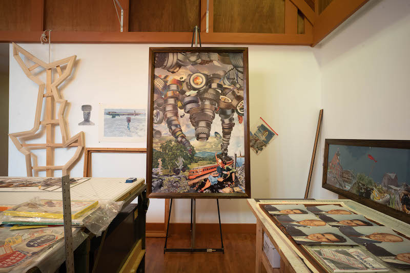 Also, you’ve probably noticed that things are hung, kind of like a gallery here. One room is kind of salon style, with all monochromatic work and there are bigger things in other rooms. The Duchamp room is a room that I use to teach in. So students come down and they go through the books. If they’re interested, they take something to do more research from.
I kind of like having a house that’s equal parts studio, school, storage facility and, I don’t know, lair in the super villain sense. I mean, it’s a place where I could have a lot of people over. For the first time in my life, I can have a lot of guests. I can sleep 10 people in beds.
RL: You are known for your collages, but also for your installation pieces, your “un-vironments.” How would you describe the difference between them and the effect you would like each of them to have on the viewer?
MO: The answer is that they’re harder to do. I learn more and I often think at the onset, “I’m not going to be able to pull this off.” They are my surefire device for getting in over my head. That means that they serve a very important role, which is to unbalance me and to challenge complacency. I think it’s really easy to get complacent making the collages that I do, because they’re very pleasurable to make. I search for a long time for the images, so there’s a whole hunter/gatherer situation, and then the techniques of organization really play into the content.
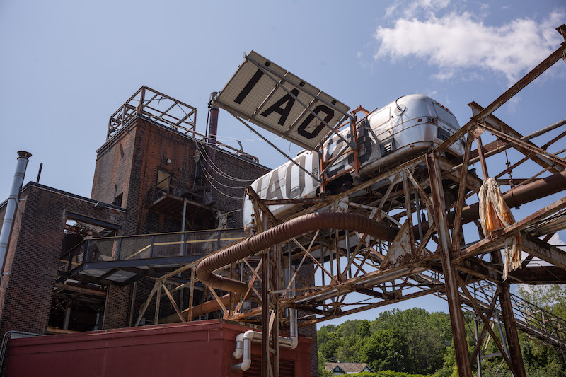
MICHAEL OATMAN: ALL UTOPIAS FEL
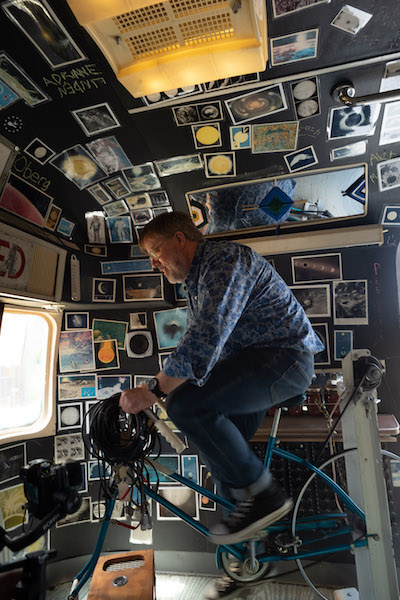
My un-vironments are places, but they are embedded with a narrative or many narratives, whether they are about eugenics or about the last man hanged in Rensselaer County. You can come into this room and any forensic psychologist could do a read on who I am, based on this stuff. Possibly white guy, born in New England, etc. But I was also making work that was about these other characters who had done heinous things or were involved in marginal activities or were complete unknowns and I just wanted to reveal somebody I had researched, or in several cases, I invented people the way that a writer of fiction does.
MICHAEL OATMAN: ALL UTOPIAS FELL
And so, the difference between installation and image has become that the collages now are starting to feel more like places, like dioramas, and the installations feel more like hundreds and hundreds of moments for still lifes. They’re yielding their other qualities in terms of the time that I spend with each of them … My 20-feet long by 2-feet tall collages, which I have made four of now, can be immersive as an environment. To me, they are like camera pans, like in a cul-de-sac or in a neighborhood, and they’re often concerned with domestic themes or the stewardship or the environment.
You have to walk along this Cape Cod beach and see the medical waste and see the robotics and to see the hybrid animals. Or in a very big piece that was commissioned for the Hamilton College Museum, the Wellin, “The Branch, or the site of our complete freedom” is the full title; it is comprised of eight panels and is 30 feet by 10 feet. In eight or nine frames it shows the temporal, seasonal evolution of a tree throughout a year and, really, throughout time. It’s kind of my version of a book of hours. It goes from night to day, spring, summer, fall, winter. It shows kind of an historical evolution of our relationship with animals, with genetics, with mechanics. I don’t want the viewer to have that straight-up Renaissance window, one single focal point. I want you to move around. I want you to look up. In fact, that piece is showed with a viewing stand and a pair of binoculars, so you can look at it like a bird watcher.
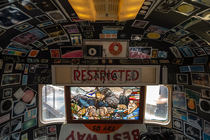
MICHAEL OATMAN: ALL UTOPIAS FELL
RL: How long will your un-vironment “All Utopias Fell” be displayed at MASS MoCA?
MO: 2020 is when the contract ends. But, Larry Smallwood, who up until about two years ago was the deputy director, asked me if I would renew the contract. I was delighted. Larry’s moved on to The Clark, as the deputy director of The Clark and Joe, I think, is a fan of the piece, Joe Thompson. It sells a lot of T-shirts. I originally pitched it as the sort of updated version of Natalie Jeremijenko’s “Trees.”
I wanted it to be a new icon for MASS MoCA. Especially because the original invitation was to make a piece about solar power and I felt really good about an artwork that would do double duty as a sustainable energy machine. Maybe people would get more interested in solar and sustainability if they could possibly get a little captivated or charmed by this component of it. It’s especially interesting when children come upon this piece. I think most adults understand it as an artwork, but kids really understand it as a feeling or a place. Some adults have come over to that.
There have been several weddings, marriage ceremonies held in it. We know that people have carried on amorous activities inside. People are often reading the books and taking things and leaving things. That doesn’t really happen with a picture. I imagine the “Mona Lisa” as an example where, of course, that happens. People make pilgrimages. People get pictures of themselves next to it. It’s transcended art at that point; it’s something else. It’s part of the human mystery.
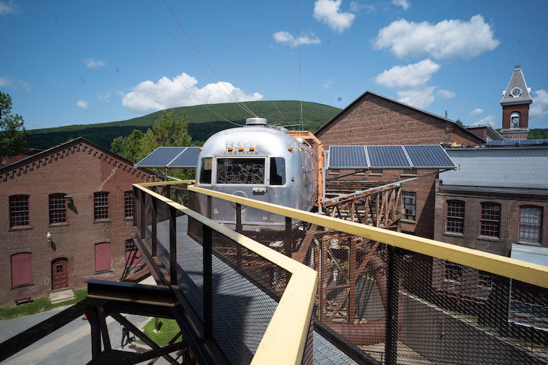
MICHAEL OATMAN: ALL UTOPIAS FELL
I think that this piece has been a good one for me because all of my installations, prior to maybe one other one than this, always got dismantled at the end. I’ve been teaching architecture now for 20 years and I have more of an interest in permanence or permanent decay than the limited run. I hope that MASS MoCA keeps it forever. What am I going to do with it? A guest house? A guest room?

MICHAEL OATMAN: ALL UTOPIAS FELL
Let Michael Oatman guide you through “All Utopias Fell” in this exclusive video:
Collab Arts Oatman Carusi guided tour from Open Stage Media LocalFreespeech on Vimeo.

