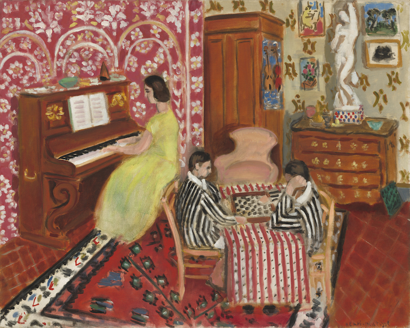
Above: Henri Matisse (French, 1869–1954), Pianist and Checker Players, 1924. Oil on canvas, 29 × 36 3/8 in. National Gallery of Art, Collection of Mr. and Mrs. Paul Mellon, 1985.64.25
Swirling symmetrical patterns. Intricate geometric design. The Clark Art Institute’s latest exhibit, “Arabesque,” celebrates the historic, spiritual and ornamental style—originally crafted in Islamic art and architecture that in itself long predated the Islamic religion—in some of its most original forms as well as the interesting ways it was adopted in various phases of European culture from German romanticism to the pre-Raphaelites, Nabi artists and art nouveau.
There is a fantastic range of material on display at the Williamstown, Mass., museum through March 22, from illustrations in German fairytale books to art nouveau paintings, 19th century advertising posters, abstract prints created with advanced techniques, painstakingly detailed furniture, decoration and tapestry as well as a series of interactive events around film, dance and music.
This celebration of the distinct, multicultural art form of arabesque feels all the more pertinent when taking into account our current state of affairs. Walking around the room one can feel the real weight of what European artists have drawn from for centuries, and curator Anne Leonard, Manton curator of prints, drawings and photographs at the Clark, has taken care to note that.
A message greets visitors entering the exhibit: “As history has shown, there are often issues of misunderstanding when one culture borrows the imagery and ideas of another. These concerns are an active consideration today as we continue to grapple with problematic issues of power and appropriation.”
“They didn’t think of their sources as Islamic,” Leonard tells The Collaborative, gesturing to the display of German romantic literary material. “They thought of it as a very, sort of, native German nationalist tradition. And then it was only after this era, the 1830s and ’40s, that European artists started going to the source: Where are the monuments where this Arabic decoration is happening in three dimensions and then how do they import it into their own visual designs? So the idea of the exhibition is really these different moments in the 19th century when it started popping up in different ways.”
Viewers can explore this through the various chromolithograph plates featured from Victorian architect and designer Owen Jones’ book “The Grammar of Ornament” (1956) as well as those depicting the shining star of arabesque art itself in “Alhambra” (1842)—based on the La Alhambra fortress in Granada, Spain, where Jones visited artist Jules Goury.
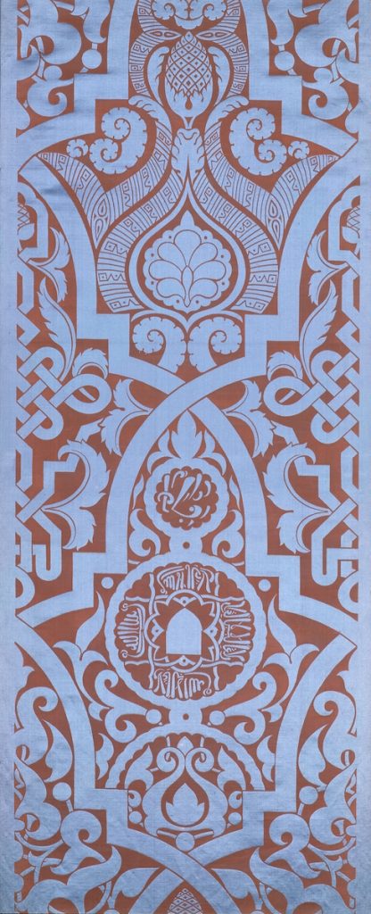
The exhibit describes these books as “essential design sourcebooks for European theorists and practitioners…read as an encyclopedia from which universalizing principles of design could be drawn. Its wealth of patterns became something more like sample swatches, to be excised, rescaled, and repurposed in discrete works of art by European makers.”
Recognizing the swirling, nature-based lines, symmetrical shapes and detailed textures in the works leading into the 20th century feels like putting together an exciting puzzle. The bending forests and ornate designs of German etcher Eugen Napoleon Neureuther’s border designs and fairy tale illustrations like the tour de force that is “Little Briar Rose (Sleeping Beauty)” (1836) are breathtaking. Later, in Czech artist Alphonse Marie Mucha’s color silkscreen and lithograph posters like “JOB” (1896) and “Biscuits Lefèvre-Utile” (1896), similarities in the swirling illustrations of women’s hair and intricate borders introduce themselves. Though only 60 years apart, in medium, the works feel both worlds away from each other and intrinsically tied by design.
The same can be said for the presentation of Alhambra’s tile patterns featured in Jones’ work—originally designed and laid down in the palace before the 14th century—and the solitary 1924 painting by Henri Matisse, “Pianist and Checker Players.” When standing toward the exit of the exhibit with both in one’s visual periphery, the exhibit as a whole feels profound and powerful—that such color and pattern could make that impact over centuries of art and cultural movements.
“It’s rather late relative to the rest, but we do know that he visited the Alhambra and was super inspired,” Leonard says. “It’s very much that building of one person’s influence on top of another in one space. It’s overwhelming and immersive in design but nonetheless a harmonious space.”
Leonard, a specialist in 19th century art, began arranging “Arabesque” while at her former institution, the University of Chicago, where she studied the art form through the lenses of music, dance, literature and visual art with a focus on its intercultural and interorigin aspects.
“Artists were really taking from here and there, just putting together combinations that don’t necessarily respect the historical boundaries. For them, it’s just like a grab bag,” she said.
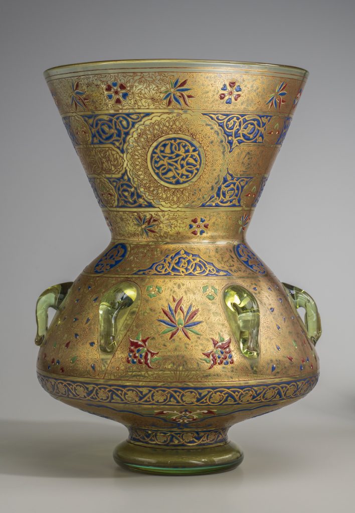
The Clark’s Manager of Public Relations and Marketing Sally Morse Majewski told The Collaborative the exhibit took two or three years to complete, as they acquired pieces from all over the country. Only a handful of works, such as Georges de Feure’s color lithograph on paper “La Femme Fatale” (1896) or Philippe-Joseph Brocard’s enameled, gilded, and applied glass “Mosque Lamp” (1880), come from the Clark.
“I think it’s good,” Majewski says about the variety of source material. “We always try to integrate something from our own collection because it makes you look at them differently.”
Individual pieces are put into new context and enjoyed in a new light. Again, we see more harmony.
Some pieces introduce viewers to the arabesque’s multi genre influence over the years.
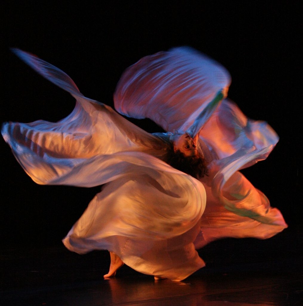
Henri de Toulouse-Lautrec’s revolutionary lithograph print “Miss Loïe Fuller” (1893) introduces the “Arabesque” audience to the American modern dance pioneer that will be the subject of dancer and choreographer Jody Sperling’s March 1 performance at the Clark. The piece, as well as a short lecture, will celebrate Fuller’s use of fabric, motion, stage design and light as well as the arabesque influence on dance. Sperling is the foremost modern interpreter of Fuller’s distinctive art nouveau choreography.
“The figure is practically unrecognizable as a human body, just the billowing of her gigantic costume, but also that it’s off center and follows his own cutting,” Leonard describes. “He’s printed this to color with the multiple colors superimposed. In this one in particular—and some others that were very, very special—he dusted them with metallic golden silver powder just to make them sparkle. For him, it’s not a publicity image. It’s like a treasure. It’s a precious object…This was her favorite image of herself.”
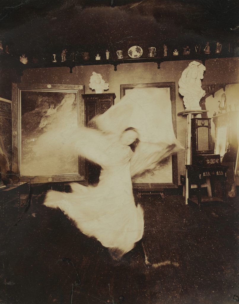
In Toulouse-Lautrec’s depiction of Fuller, she is nearly abstract. For reference, a series of photographs by Harry C. Ellis, borrowed from the Williams College Museum of Art down the road, are displayed alongside the lithograph. Taken in 1910, “Loïe Fuller practicing at home in front of a Mucha playbill, Passy near Paris” shows the dancer in constant, flowing movement—typical of the swirling patterns in arabesque—in front of a poster advertisement depicting herself, by art nouveau artist Mucha.
Sperling, who has been performing Fuller-inspired work for nearly 20 years, told The Collaborative that her performance will help bring these pieces by Ellis and Toulouse-Lautrec to life, as well as the choreographer’s signature serpentine dance style. Sperling will use fabrics and light in much the same way as her predecessor.
“I come from a post-modern dance background and what captivated me about this style is the way these swirling lines can be deployed to take on natural forms. In Fuller’s signature ‘fire dance’ she appears herself to immolate from the swirls of fabric that mimic licking flames,” she says.
In that same style, Sperling will use fabric to suggest the shifting of sea ice and the experience of wind, addressing the accelerating effects of climate change. She will present where Fuller’s style lands, historically, in the art form of arabesque while bringing it to life in a 21st century context to portray its ongoing influence.
“In art, there is a very clear sense of artists responding to the one who came before,” she says. “But sometimes we lose the longer trajectory. We see one generation before but not necessarily understanding this force of history acting through different artistic styles and mediums.”
“I think part of the reason that people, even in our own day, still feel very connected to these kinds of designs is they did infiltrate all the popular culture,” Leonard says. “Look at art nouveau with these advertising posters that incorporated it into the visual culture of that day. Westerners now are drawn to that kind of visual style but it’s helpful to go back and understand: What is it really drawing upon?”
“Arabesque” is on view through March 22 at The Clark Art Institute, Williamstown, Mass. For more information about Jody Sperling’s March 1 performance and other exhibit-related events, visit here.
Trackbacks/Pingbacks